
Arabic Calligraphy Fonts: Which Style to Try First for Elegant Arabic Text
Compare arabic calligraphy fonts by mood, readability, and use case so you can pick a better Arabic style for invitations, quotes, logos, and social posts.
People usually search for arabic calligraphy fonts when plain text feels too ordinary. They want something with presence: a wedding title that feels graceful, a quote image with more emotion, a logo idea with stronger character, or a short phrase that looks crafted instead of generic.
The problem is that arabic calligraphy fonts do not all create the same impression. Some feel ceremonial. Some feel intimate. Some are easy to read at a glance, while others are better for short decorative lines. If you only judge them by font names, you can end up choosing a style that looks impressive but does not match your actual project.
NuqtaForge helps by letting you test Arabic text in several script-inspired directions before you export anything. That makes it easier to compare mood, spacing, and legibility with your own words instead of relying on a specimen image.
TL;DR: The best way to choose arabic calligraphy fonts is to begin with your real phrase, compare a few distinct styles, and judge each one by purpose rather than decoration alone. On NuqtaForge, Thuluth, Diwani, Kufic, Naskh, Ruq'ah, and Nastaliq each create a different kind of calligraphic feeling, so the strongest result usually comes from matching the script mood to the job.
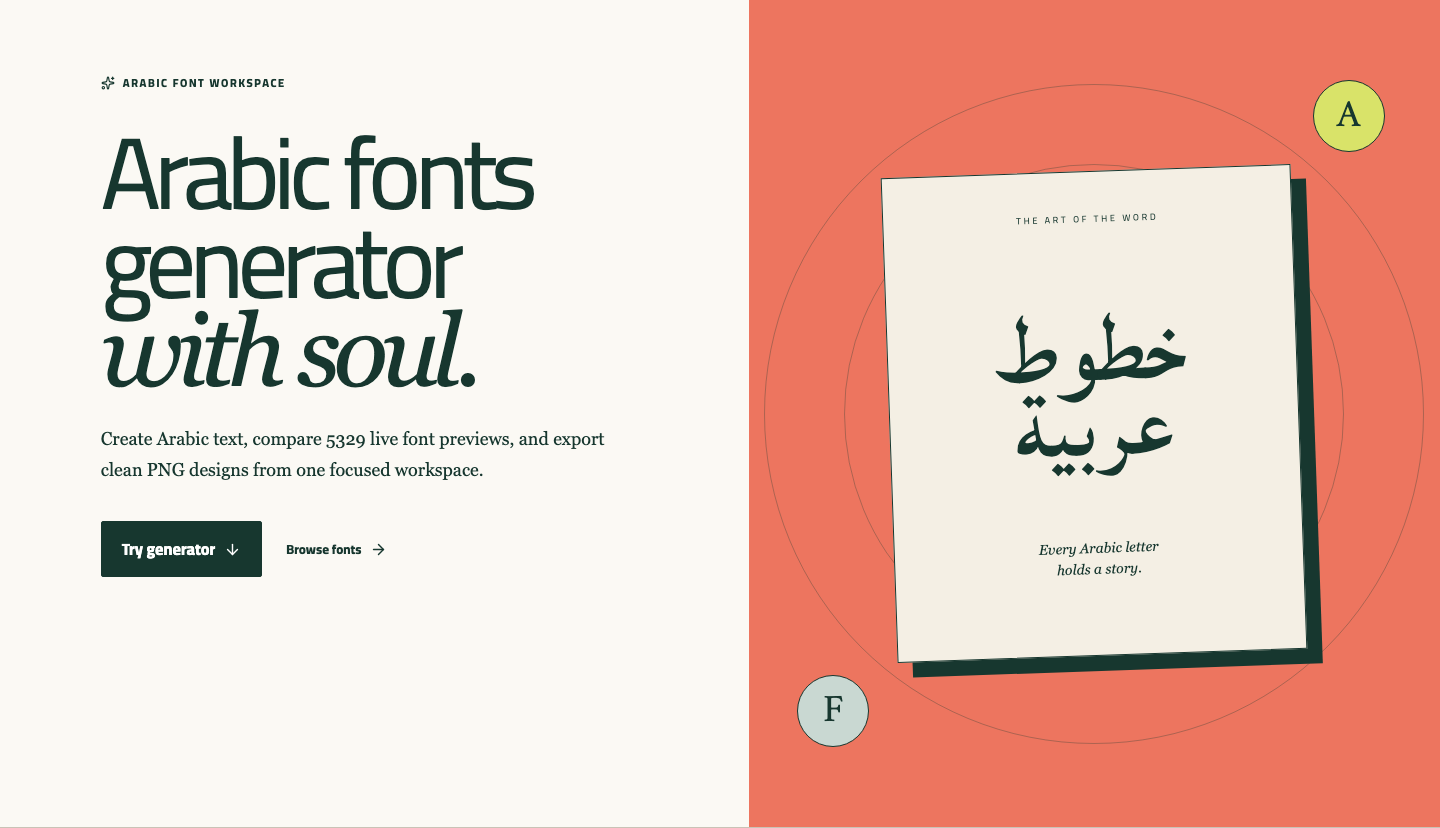
The homepage gives you a quick place to begin testing arabic calligraphy fonts with your own text instead of a fixed sample.
What people usually mean by arabic calligraphy fonts
When users look for arabic calligraphy fonts, they are often not searching for one exact family. They are looking for a style that feels artistic, traditional, expressive, or refined. In practice, that can include several very different script traditions.
Some people want upright, stately shapes for a formal heading. Others want something flowing for a greeting card. Others want a geometric look that feels designed rather than handwritten. That is why arabic calligraphy fonts should be treated as a choice between script personalities, not as one single category.
On this site, the most relevant calligraphic directions are:
- Thuluth for grand display lines
- Diwani for ornate, flowing elegance
- Kufic for angular and structured composition
- Naskh for classic readability with a traditional tone
- Ruq'ah for a direct handwritten feel
- Nastaliq for lyrical Persian and Urdu presentation
Start with purpose, not with the fanciest shape
The most common mistake with arabic calligraphy fonts is choosing the most dramatic option first. That often works badly because the project may need readability, balance, or a specific emotional tone more than visual complexity.
Try asking one simple question before you compare fonts: what does this text need to do?
- A wedding line may need softness and elegance
- A mosque event heading may need dignity and scale
- A logo concept may need a strong silhouette
- A quote image may need readability on mobile
- A poetry line may need movement and rhythm
Once you know the job, arabic calligraphy fonts become much easier to judge.
Which arabic calligraphy fonts style fits which project?
Thuluth for ceremonial presence
If your phrase needs to feel elevated, arabic calligraphy fonts inspired by Thuluth are often the first style to test. Thuluth has tall verticals, wide curves, and an unmistakable sense of announcement. It works especially well for headings, event titles, spiritual phrases, and premium invitation concepts.
Thuluth is usually strongest when the text is short. It needs visual room. If the line is too long or the canvas is too shallow, the style loses some of its authority.
Diwani for flowing elegance
Diwani is one of the most expressive directions among arabic calligraphy fonts. It feels soft, ornamental, and intimate, which makes it useful for names, monograms, wedding graphics, and decorative quote cards. The joined movement gives the text a courtly, almost ribbon-like quality.
That same beauty can reduce clarity if you use too many words. Diwani works best when you want atmosphere first and quick reading second.
Kufic for bold structure
Not everyone thinks of Kufic first when searching for arabic calligraphy fonts, but it belongs in the comparison because it creates a striking calligraphic effect through geometry rather than flourish. If the project needs a compact logo shape, a badge, or a powerful title block, Kufic can be much more effective than a softer style.
Kufic usually wins when the phrase is short and the design needs a clear outline from far away.
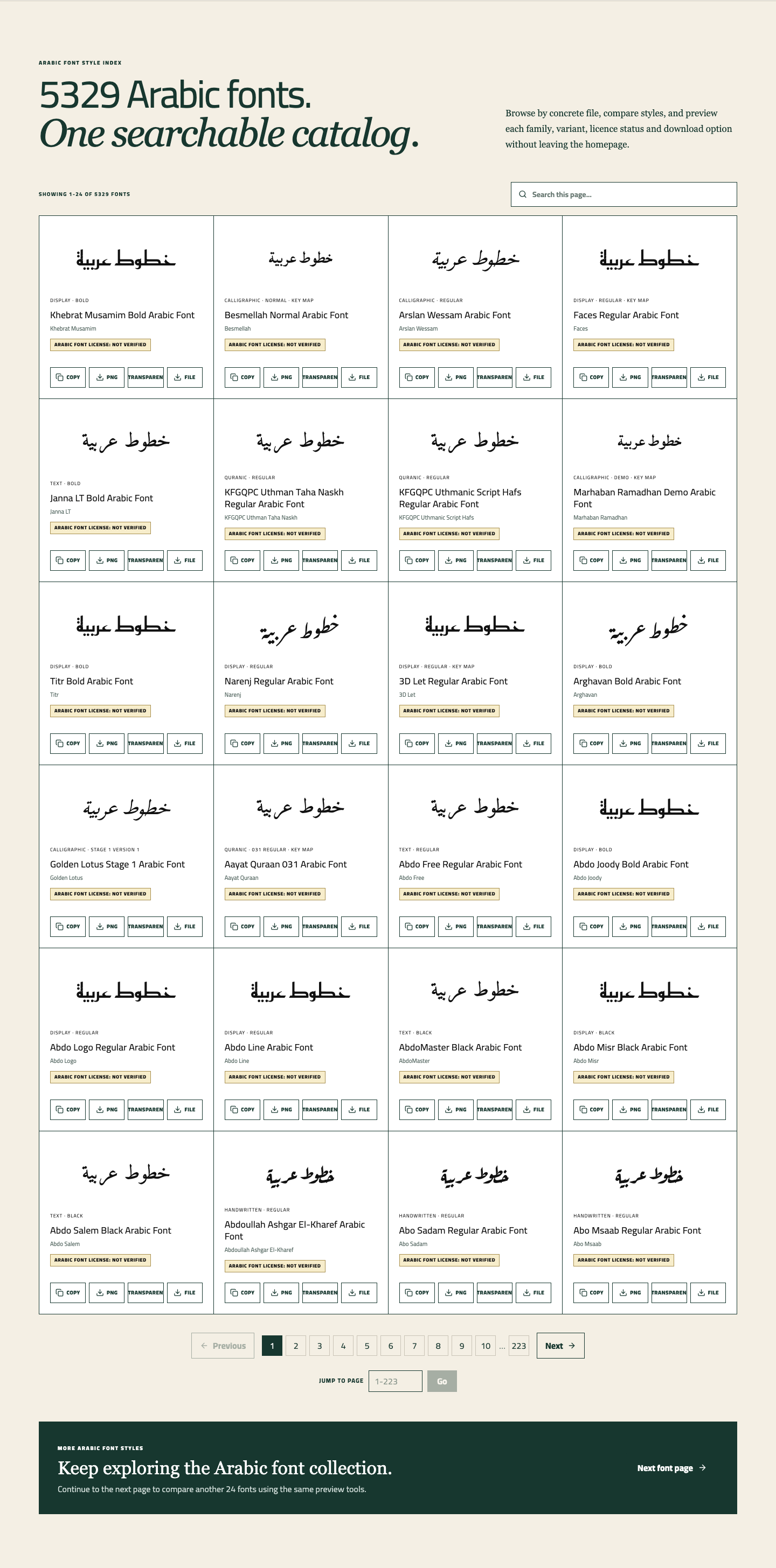
Comparing several script-inspired styles side by side makes it easier to see whether your phrase needs geometry, softness, or ceremonial movement.
Naskh for classic balance
Some users skip Naskh because they assume arabic calligraphy fonts must always look ornate. That is a mistake. A good Naskh-based preview often gives the most reliable blend of tradition and readability. If your text needs to feel classical without becoming overly decorative, Naskh can be the best starting point.
It is especially useful for titles that still need to be read comfortably, longer quote lines, and educational or cultural graphics where elegance matters but clarity matters more.
Ruq'ah for a human, immediate touch
Ruq'ah belongs to the more casual end of arabic calligraphy fonts. It can be useful when you want something that feels written by hand rather than staged. For social posts, short notes, or personal quote graphics, that directness can feel more alive than a formal calligraphic script.
Ruq'ah is not the right choice for every ceremonial project, but it is a strong option when warmth matters more than grandeur.
Nastaliq for poetic flow
When the text is in Persian or Urdu, arabic calligraphy fonts often lead people toward Nastaliq. Its descending rhythm and sloped construction create a lyrical texture that is hard to replace with any other style. It is especially fitting for poetry, literary titles, and cultural artwork.
For standard Arabic headings, however, it is not automatically the best decorative choice. Nastaliq should be chosen because the language and the visual tradition suit it, not simply because it looks artistic.
How to compare arabic calligraphy fonts without guessing
NuqtaForge is useful here because it keeps comparison practical.
1. Enter the exact phrase you plan to use
Many arabic calligraphy fonts look excellent in a sample but behave differently with your real wording. A short name may look perfect in one style and awkward in another. A spiritual quote may become too tight in a decorative script. Testing your real phrase removes that guesswork.
2. Compare only a few styles at a time
You do not need to test twenty versions. For most projects, three styles are enough. For example:
- Thuluth vs Diwani for formal elegance
- Kufic vs Naskh for structure versus readability
- Naskh vs Ruq'ah for classical versus casual tone
This is a much better way to evaluate arabic calligraphy fonts than endless browsing.
3. Change size before making the final decision
Calligraphic styles respond strongly to scale. A font that seems delicate at one size may become beautiful at a larger size. Another may look balanced when large but crowded when small. Before exporting, adjust the preview size and make sure the style still works in the layout you have in mind.
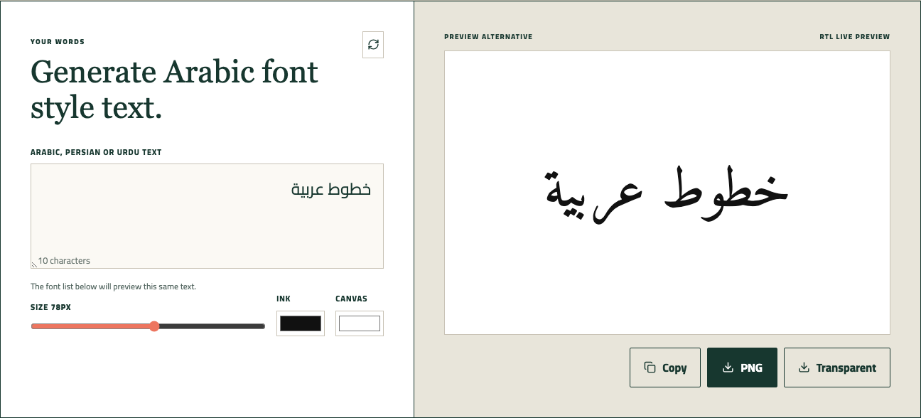
The live preview area lets you change text and compare how arabic calligraphy fonts behave with the exact phrase you plan to share or export.
4. Export one sample and review it outside the page
If two options still feel close, export both. Seeing arabic calligraphy fonts as PNG results inside a mockup, a social draft, or a presentation board often makes the right choice obvious.
Want to try it yourself? Jump back to the homepage.
Use this interactive preview as a quick starting point. If you want to compare more font styles, use the buttons below to open the homepage generator or browse the full font directory.
Try this Arabic font.
The font list below will preview this same text.
Signs that you picked the wrong arabic calligraphy fonts style
Even attractive arabic calligraphy fonts can be the wrong match. Watch for these warning signs:
- The text looks impressive but is slow to recognize
- The style dominates the message instead of supporting it
- The line feels cramped when the phrase gets longer
- The font loses clarity on a phone screen
- The visual tone does not match the occasion
Usually, the best answer is not to force the decorative option. Step back and compare one calmer alternative.
A simple decision guide for arabic calligraphy fonts
If you need a fast starting point, use this rule:
- Choose Thuluth for formal, elevated display
- Choose Diwani for elegant names and invitations
- Choose Kufic for logos and bold title shapes
- Choose Naskh for traditional clarity
- Choose Ruq'ah for personal, handwritten energy
- Choose Nastaliq for Urdu or Persian poetic flow
This framework helps narrow down arabic calligraphy fonts without pretending that one style is best for everything.
FAQ
Are arabic calligraphy fonts always hard to read?
No. Some arabic calligraphy fonts are decorative, but others remain very readable. Naskh is usually the safest option when you want a traditional appearance without sacrificing too much clarity.
Which arabic calligraphy fonts style is best for wedding designs?
Diwani is often a strong first test for wedding graphics because it feels soft and elegant. Thuluth can also work well for a more monumental or formal tone.
Can arabic calligraphy fonts work for logos?
Yes, especially short-word logos. Kufic is often effective when the design needs a strong shape, while Diwani can suit luxury or intimate branding concepts.
Should I choose the most decorative option first?
Usually no. With arabic calligraphy fonts, the best result comes from matching the style to the message, not from picking the busiest design.
Final thoughts
The right arabic calligraphy fonts choice is less about chasing ornament and more about finding a script mood that supports your text. When you compare a few distinct directions with your real phrase, the decision becomes much clearer.
If you want a reliable place to start, try your phrase on NuqtaForge, compare Thuluth, Diwani, and Naskh first, then keep the version that feels both beautiful and appropriate for the job.