
Traditional Arabic Font: How to Choose a Classic Style That Still Feels Right Today
Learn what traditional arabic font usually means, which classic styles fit different projects, and how to preview them before exporting Arabic text.
Searching for a traditional arabic font usually means you want more than readable text. You want a style that feels rooted, familiar, and culturally grounded. The difficulty is that "traditional" can point to several very different directions. One person means a book-like Naskh tone. Another means the authority of Thuluth. Another imagines angular Kufic or a classical handwritten feeling.
That is why the phrase traditional arabic font is useful but also vague. If you treat it as one exact look, you may end up choosing a style that feels old-fashioned in the wrong way, too formal for the project, or simply harder to read than necessary.
NuqtaForge helps by turning that vague search into a visual comparison. Instead of picking a name and hoping for the best, you can preview your own words in several script-inspired directions and decide which one actually carries the kind of tradition you want.
TL;DR: A good traditional arabic font is not always the most ornate one. For many everyday projects, Naskh gives the clearest traditional feel. Thuluth adds ceremony, Kufic adds structure, Diwani adds ornament, and Ruq'ah adds handwritten immediacy. The strongest result comes from matching the classic style to the purpose, then checking the preview with your own phrase.
What does traditional arabic font usually mean?
For most users, traditional arabic font describes Arabic text that feels connected to established script traditions rather than a modern UI style or neutral sans look. That can include:
- manuscript-like readability
- classical proportions
- calligraphic stroke rhythm
- a sense of formality or heritage
- shapes that feel recognizably Arabic rather than generic
The important thing is that traditional arabic font does not always require heavy ornament. A classical appearance can come from balance and proportion just as much as from flourish.
The most useful traditional arabic font directions to compare
Naskh for classical readability
If someone asks for a traditional arabic font and gives no other context, Naskh is often the safest place to start. It is familiar, steady, and highly readable. It works for quotations, cultural graphics, educational content, invitations, and many other situations where the text must still be easy to follow.
Naskh feels traditional because it carries a long book and manuscript association, but it also adapts well to modern digital layouts. That combination makes it one of the most practical classic choices.
Thuluth for elevated formality
When a traditional arabic font needs to feel more ceremonial, Thuluth is the style to test next. It brings long verticals, sweeping curves, and a sense of display. It is often stronger for headings than for long lines, especially when the message needs visual gravity.
Thuluth is a good fit for event titles, commemorative artwork, mosque-related concepts, or premium cultural presentation. It is not always the best option for compact interfaces or small caption text.
Kufic for historical structure
Some projects need a traditional arabic font that feels strong, architectural, and deliberate. In those cases, Kufic can be more effective than a flowing script. Its geometry gives the text an engraved or built quality that works well for emblems, title blocks, and logo studies.
Kufic should usually be tested with short wording. If readability is the top priority, Naskh may still be a better match.
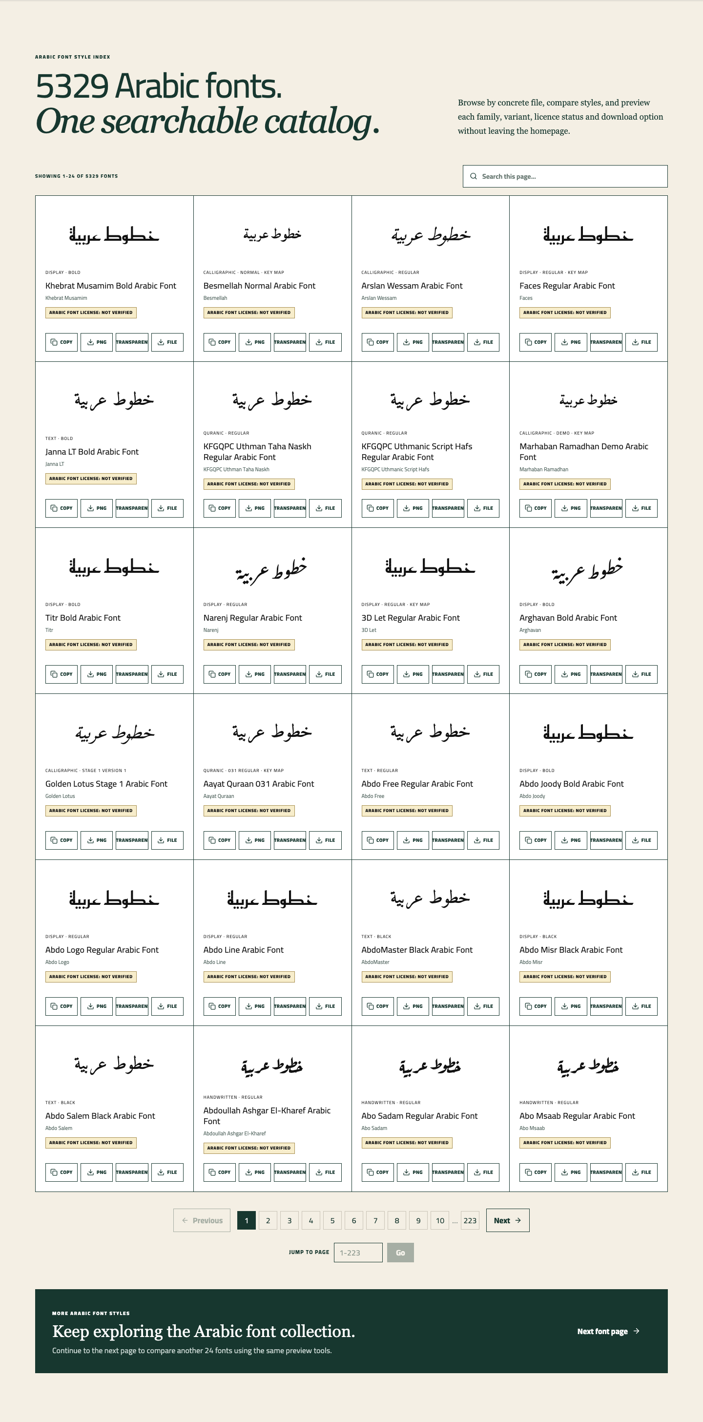
The catalog makes it easier to judge whether your traditional arabic font should feel geometric, balanced, or highly ceremonial.
Diwani for courtly decoration
Diwani can also fit the traditional arabic font search, especially when the user wants historical elegance rather than everyday readability. It feels formal in a decorative way, with closely connected letters and a flowing baseline.
This style is useful for names, invitation lines, and luxury-oriented graphics, but it can become visually dense if the phrase is too long.
Ruq'ah for traditional handwriting energy
Ruq'ah is often overlooked when people search traditional arabic font, but it is valuable when the project needs warmth and directness. It feels handwritten and familiar rather than monumental. For note-like graphics, short social visuals, or personal wording, that can be exactly the right kind of tradition.
How to decide which traditional arabic font is right
The easiest way to choose a traditional arabic font is to judge the text by three things: use case, reading distance, and emotional tone.
1. Use case
Ask what the text is for.
- For readable quotes or titles, begin with Naskh
- For ceremonial headings, test Thuluth
- For logos or strong shapes, compare Kufic
- For invitation-style elegance, try Diwani
- For personal handwritten energy, try Ruq'ah
2. Reading distance
A traditional arabic font can look perfect in a large hero image and weak in a smaller card. If the text will be seen mainly on a phone, ornament-heavy choices may lose some of their appeal. Readability usually matters more as the display size gets smaller.
3. Emotional tone
Different classic styles communicate different moods:
- Naskh feels composed
- Thuluth feels dignified
- Kufic feels solid
- Diwani feels refined
- Ruq'ah feels human
This is where many choices become clear. A traditional arabic font should support the tone of the message, not compete with it.
How to test a traditional arabic font on NuqtaForge
Enter your real phrase first
The fastest way to eliminate weak options is to test the actual wording you plan to use. A traditional arabic font should be judged with your own text, because spacing, rhythm, and shape balance can change dramatically from one phrase to another.
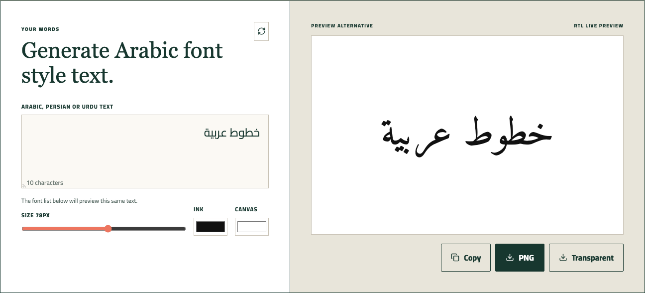
Using your own words in the live preview shows whether a traditional arabic font still feels balanced once it leaves the default sample.
Compare only two or three classic directions
Do not overcomplicate the test. For most users, a simple comparison works best:
- Naskh versus Thuluth
- Naskh versus Kufic
- Diwani versus Naskh
That gives you a practical answer much faster than browsing dozens of files under the broad label of traditional arabic font.
Adjust the preview before exporting
A classic style can shift a lot when you change size, text color, or background tone. Before deciding, try the font at the approximate scale you will actually use. This is especially important if the design is meant for posters, mobile stories, or invitation covers.

Preview settings help you see whether the traditional arabic font still works once size and contrast are closer to the final design.
Export a draft sample
PNG export is useful because it lets you inspect the traditional arabic font inside a real composition. Sometimes the right style only becomes obvious after you place it into a mockup or compare it against your actual background image.
Want to try it yourself? Jump back to the homepage.
Use this interactive preview as a quick starting point. If you want to compare more font styles, use the buttons below to open the homepage generator or browse the full font directory.
Try this Arabic font.
The font list below will preview this same text.
Mistakes people make when choosing a traditional arabic font
Several problems appear again and again:
- assuming "traditional" always means decorative
- choosing Thuluth for text that needs fast reading
- using Kufic for a phrase that needs softness
- treating Naskh as too plain without testing it first
- ignoring how the font behaves at the final display size
The best traditional arabic font choice is often the one that feels quietly correct, not the one that tries hardest to impress.
When a traditional arabic font is better than a modern UI style
A traditional arabic font is often the stronger option when the text should feel cultural, literary, formal, spiritual, or commemorative. Modern sans styles can work well for interfaces and neutral presentation, but they do not always carry the emotional weight needed for artwork, invitations, or heritage-focused content.
That does not mean a classic style is always better. It means the context matters. If the text is the emotional center of the design, a traditional arabic font often gives it more presence.
FAQ
What is the safest traditional arabic font style for most projects?
For general use, Naskh is usually the safest traditional arabic font direction because it feels classical while staying readable.
Is Thuluth better than Naskh for a traditional arabic font look?
Not always. Thuluth is stronger when you need ceremony and display scale. Naskh is usually better when readability and balance matter more.
Can a traditional arabic font work for branding?
Yes, especially for short names or marks. Kufic can be effective for structured logos, while Diwani may suit a more elegant brand direction.
Should I export before making the final decision?
Yes. A traditional arabic font can feel different once it sits in a real layout, so exporting a draft sample is a smart last check.
Final thoughts
Choosing a traditional arabic font is really about choosing the right kind of tradition. Some projects need the calm authority of Naskh. Others need the ceremony of Thuluth, the geometry of Kufic, or the decorative grace of Diwani.
If you want a faster and more reliable choice, test your phrase on NuqtaForge, compare two or three classic styles, and keep the one that still feels right after you size it, preview it, and export a sample.